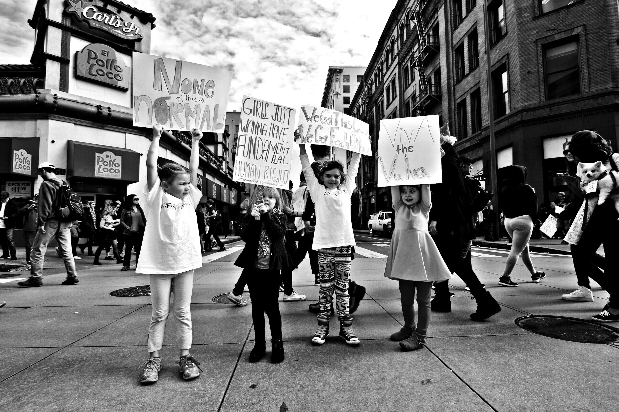
Lady Parts Justice * Rebrand
|
Lady Parts Justice * Rebrand |
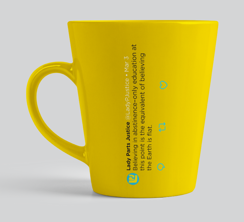
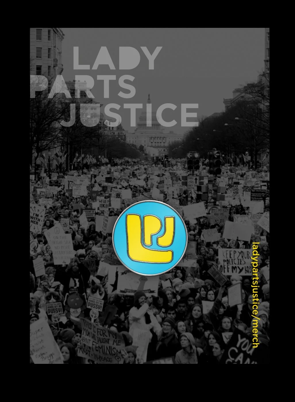
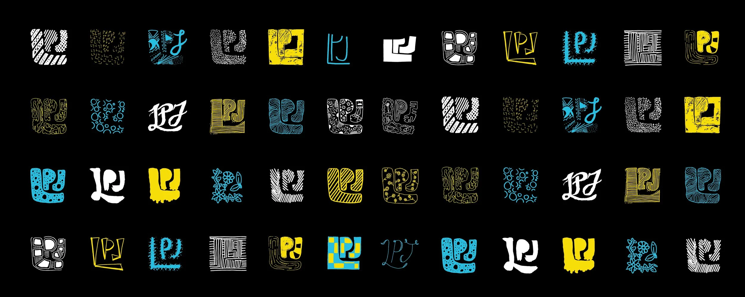
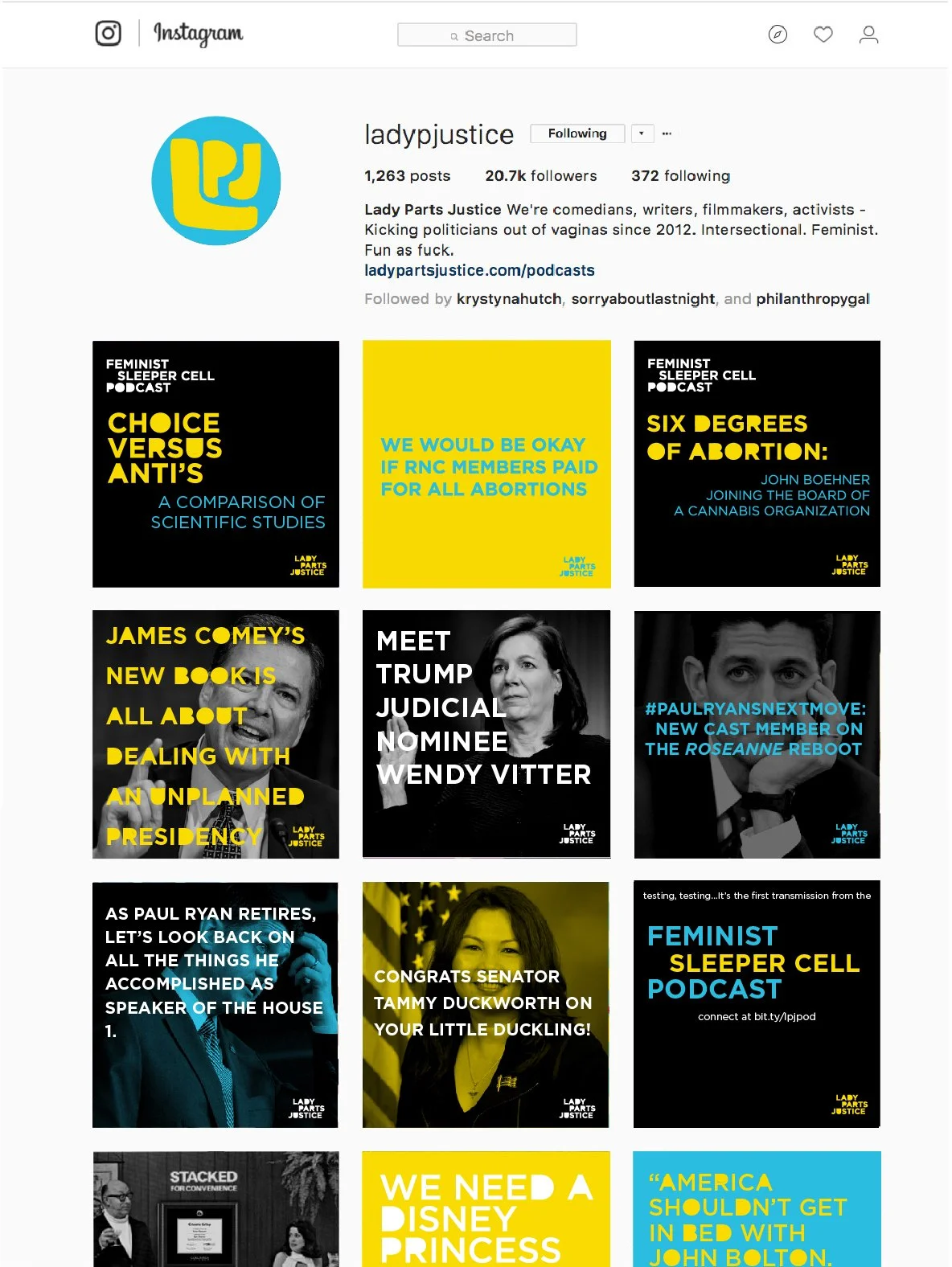
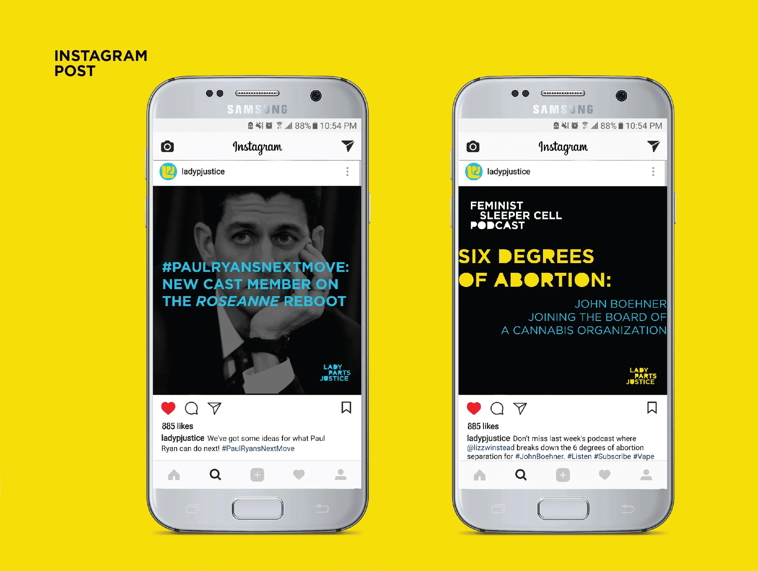
Lady Parts Justice (LPJ) is a collective of comedians using humor and social media to help voters understand the positions of politicians, bills, and campaigns. While its content was consistently funny and engaging, its visual identity did not reflect its message, tone, or audience. This rebrand brings those elements into alignment, creating a bold, cohesive identity designed to connect with supporters across social media, merchandise, and advertising.
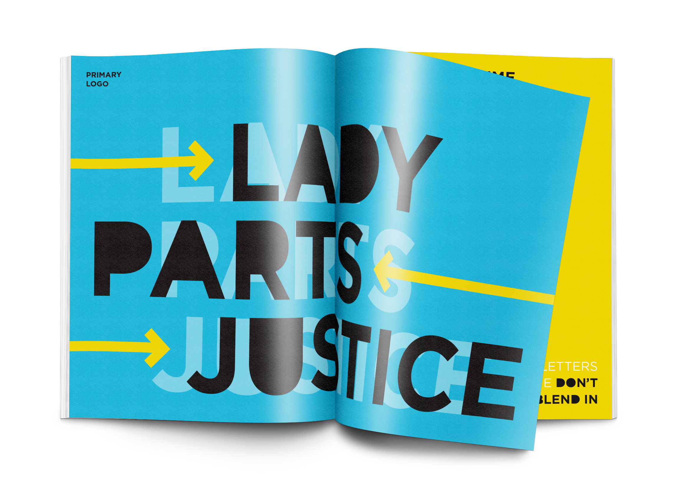
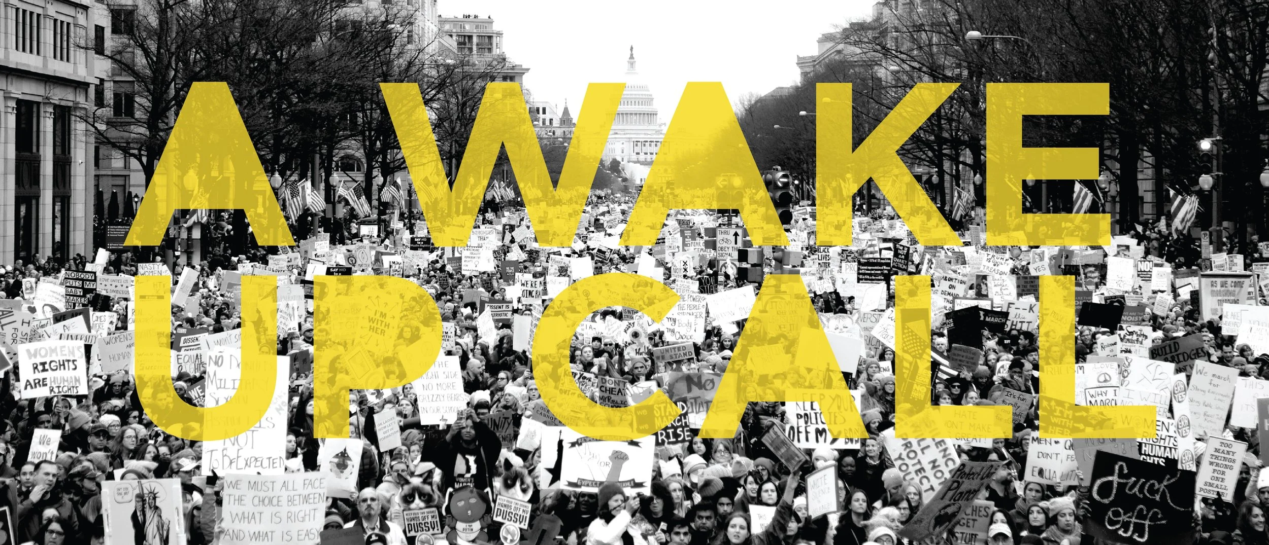
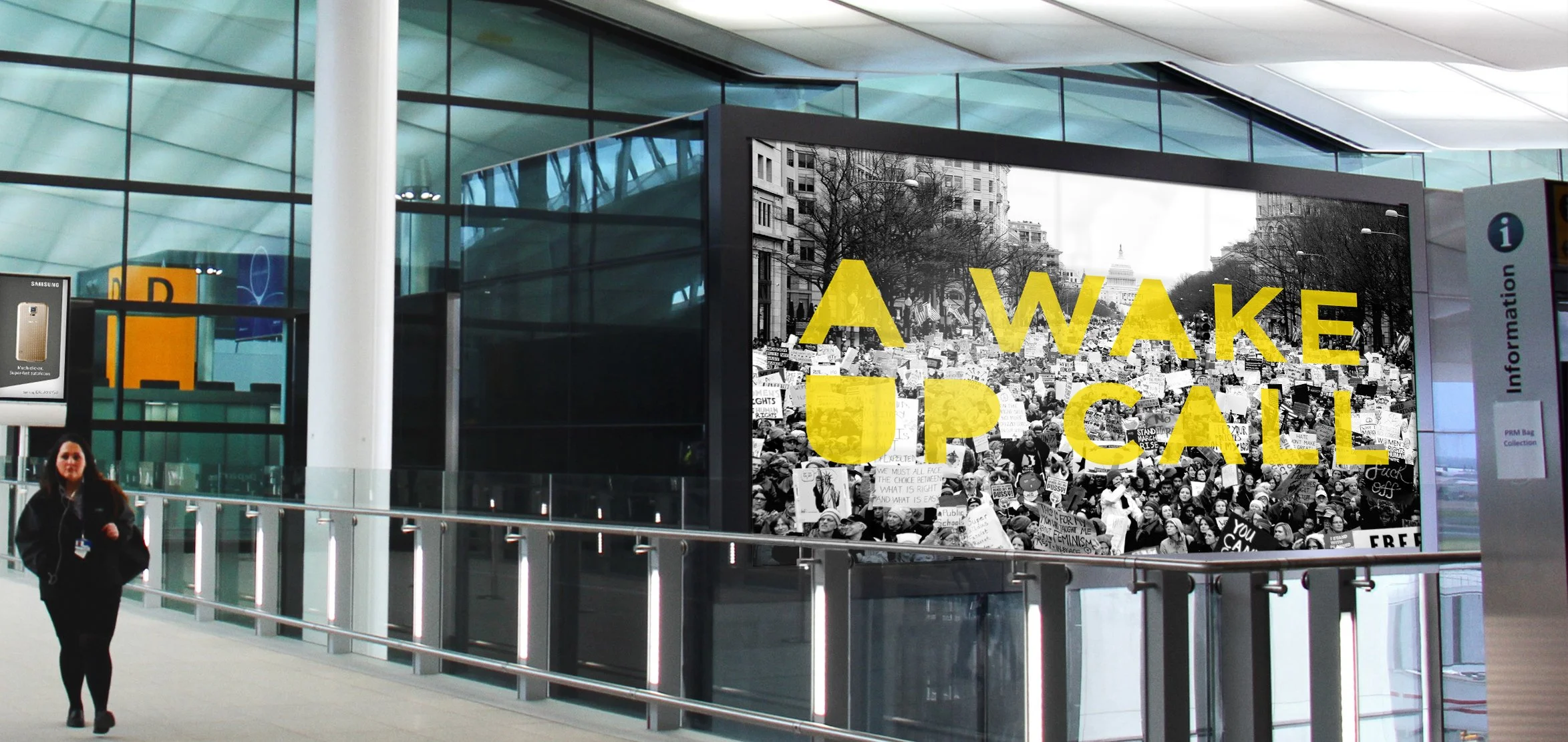
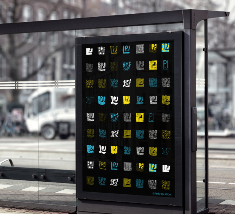
The proposed advertising campaign takes that voice beyond the screen and into public spaces. Placements in high-traffic locations—including airports, bus stops, and shopping centers—are designed to attract new followers and spark conversation among existing supporters. Rather than blending into the background, the campaign makes LPJ’s message visible, direct, and difficult to ignore.
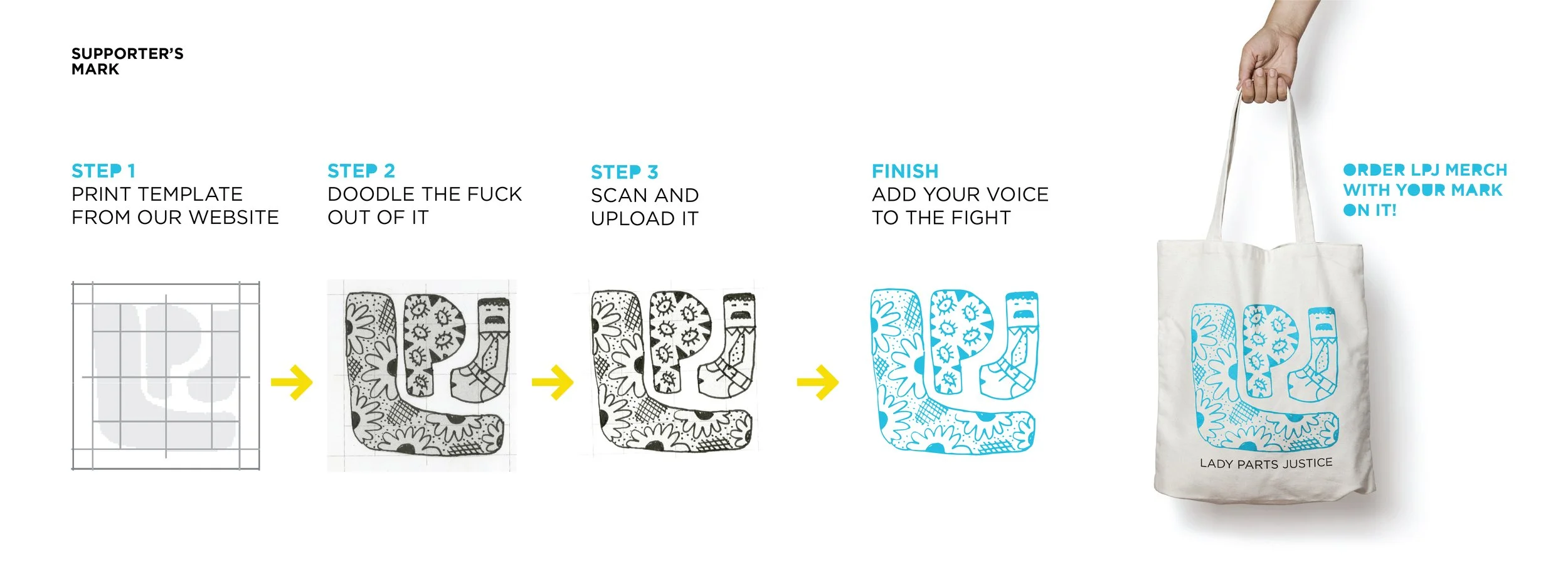
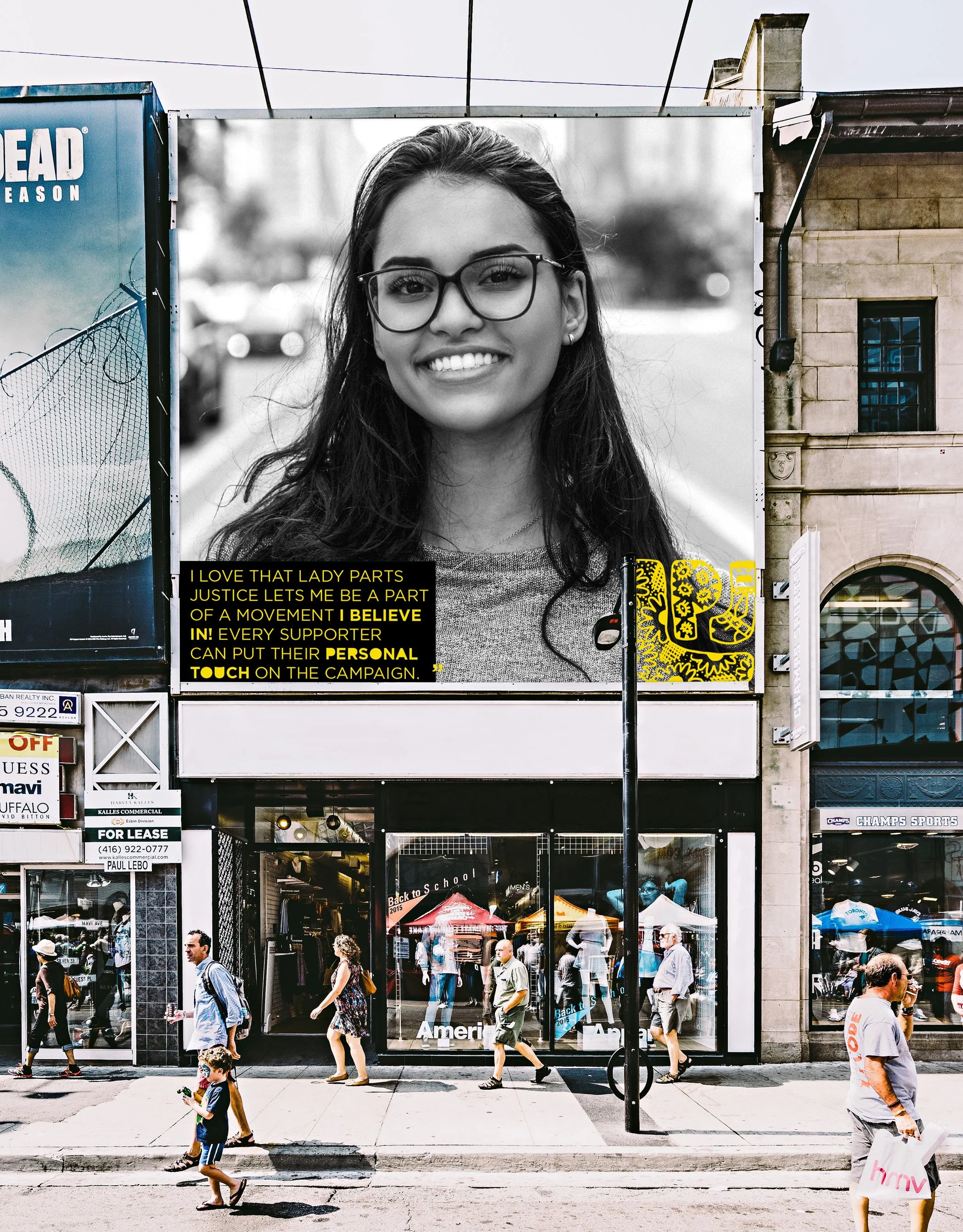
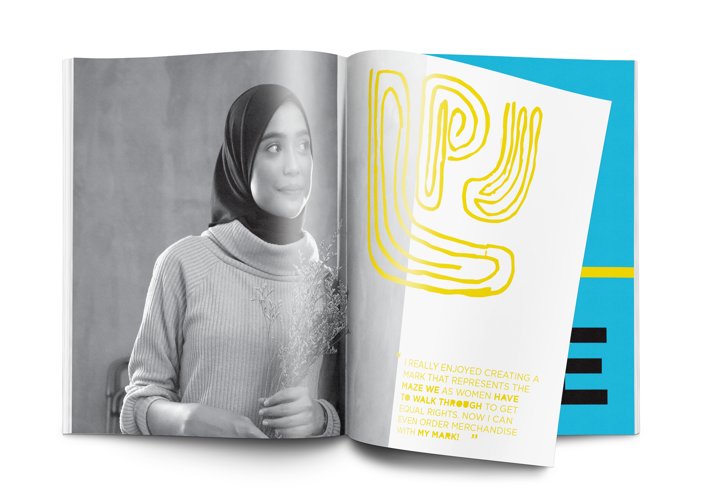
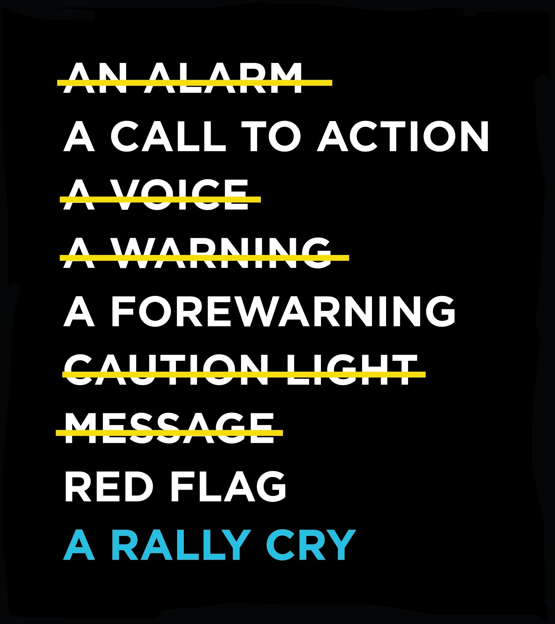
To bring the identity together, I designed a brand book that embodies the same energy as the campaign. Large typography, bold graphics, and carefully selected quotes establish a consistent tone while demonstrating how the visual system can carry LPJ’s message across every touchpoint.
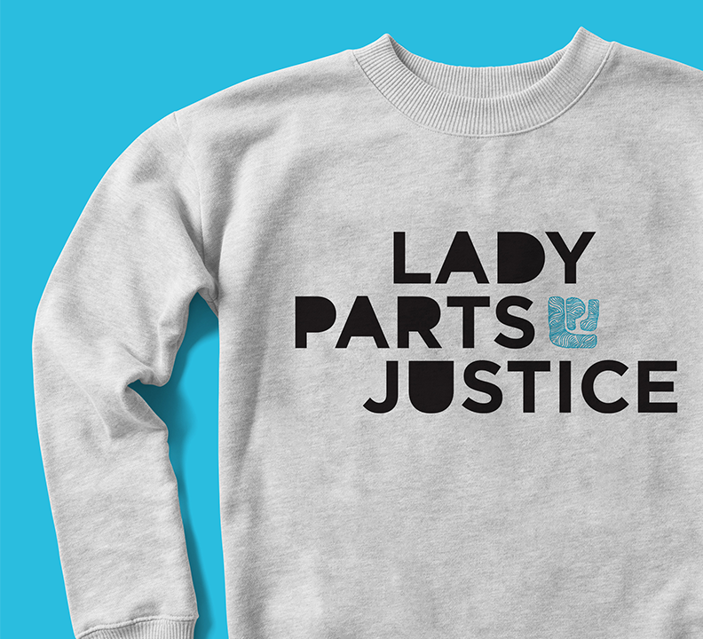
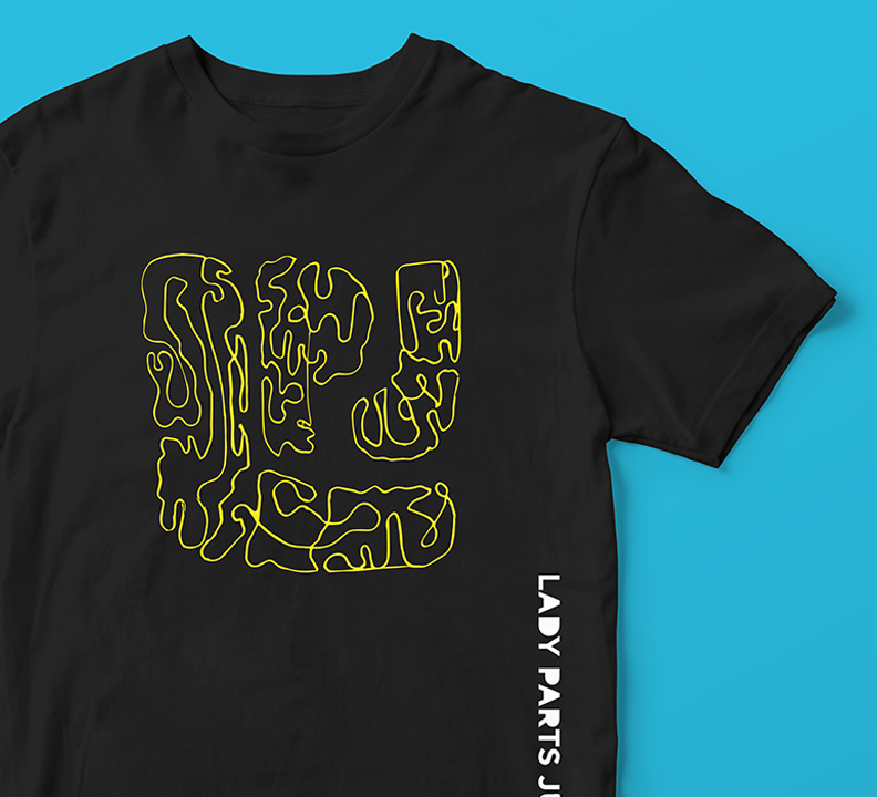
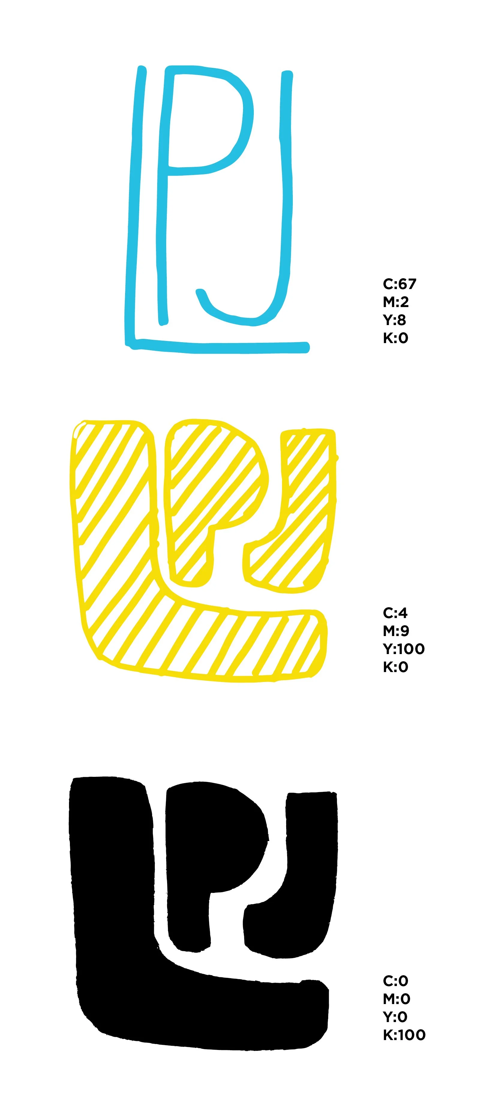
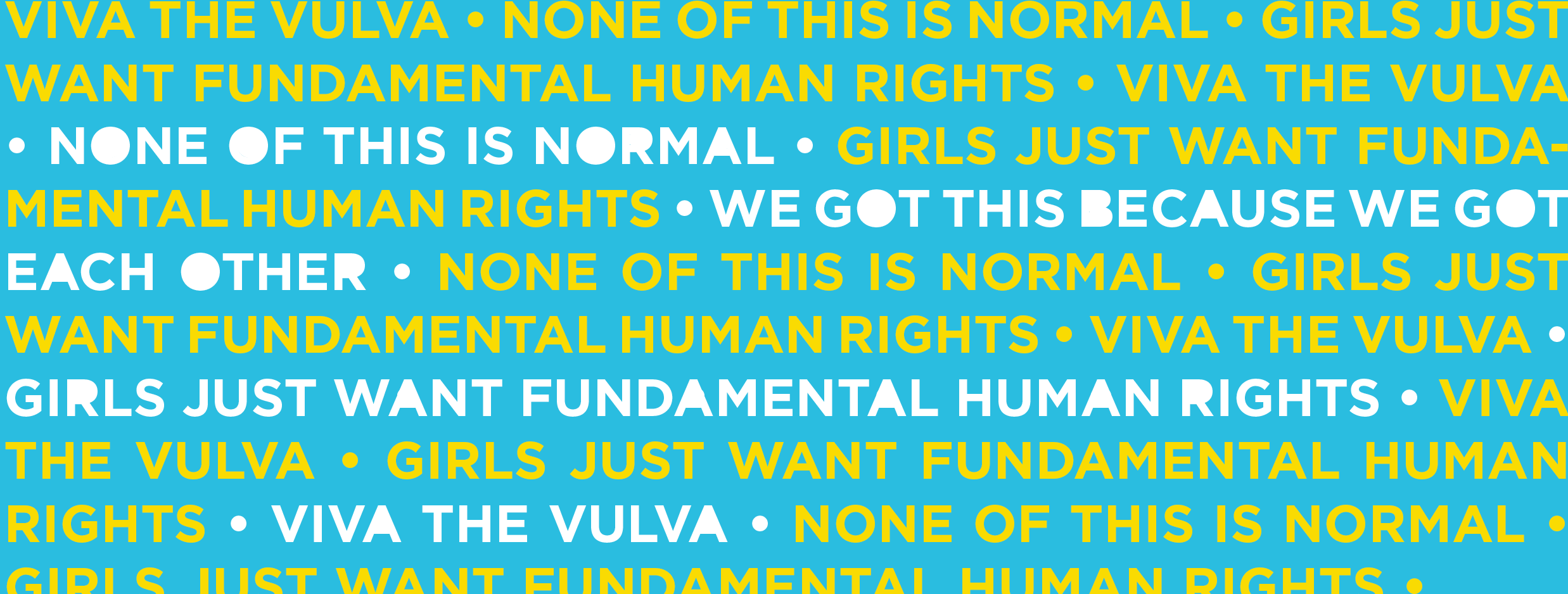
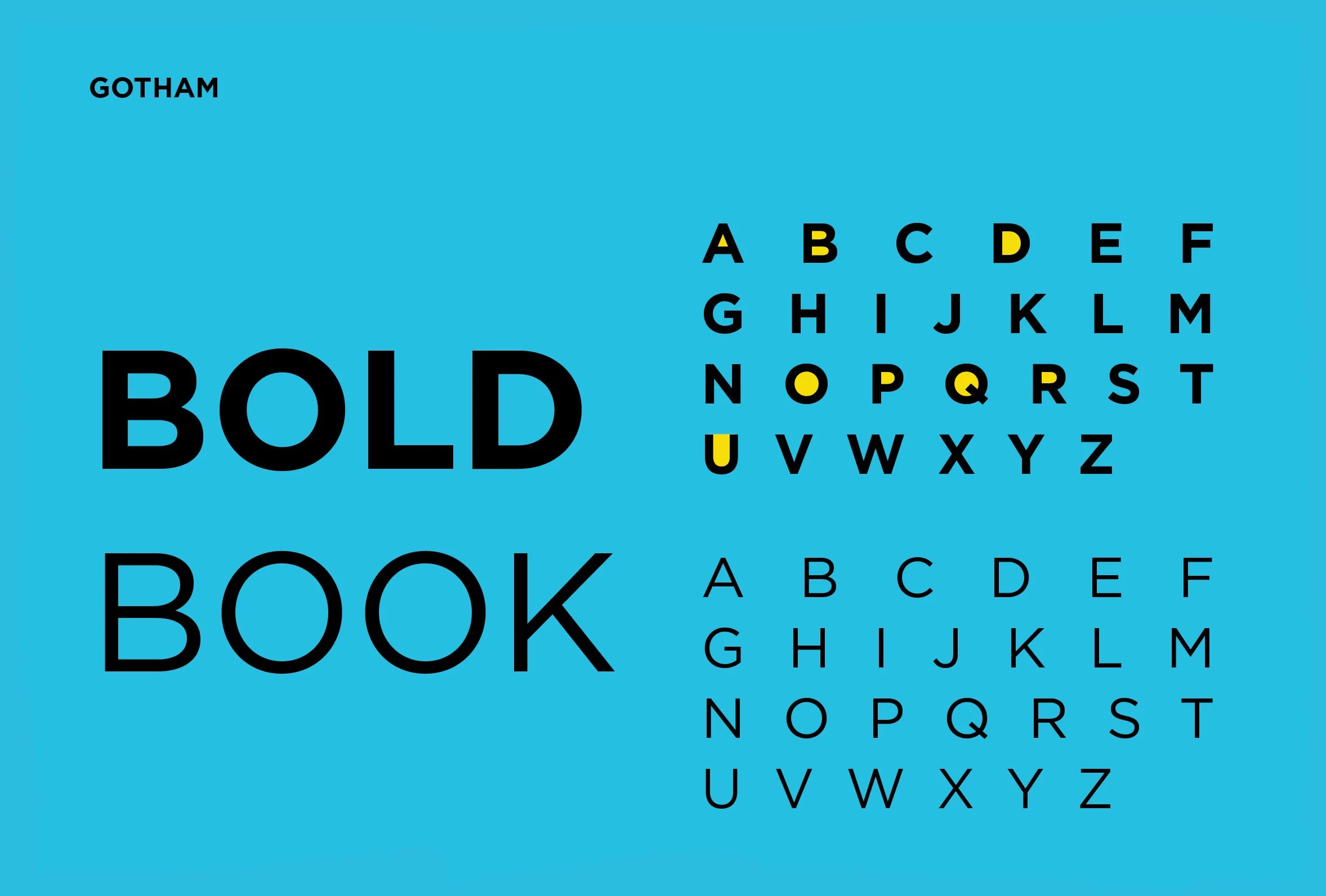
I developed a visual system that reflects LPJ’s outspoken personality and commitment to bringing people together around a common goal. Using Gotham as a foundation, I created custom letterforms for headlines to give the organization a distinctive typographic voice. Yellow highlights identify the modified letters, showcasing the details that make the typography uniquely LPJ.